 chartjs-gauge
A Chart.js plugin that adds a gauge chart type — a half-doughnut with an animated needle and a configurable value label.


![]()
Features
- Gauge chart type (
type: 'gauge') built on Chart.js's doughnut controller - Animated needle with configurable radius, width, length, and color
- Value label with custom formatter, background, border-radius, padding, and color
- Supports
minValueto offset the gauge starting point - Per-dataset
needleoverride — multiple needles in one chart - Compatible with Chart.js v4
- Works as a Laravel Composer package (publishes pre-built assets) or a standalone npm package
Installation
npm / yarn
npm install chart.js @sourcentis/chartjs-gauge
# or
yarn add chart.js @sourcentis/chartjs-gauge
Composer (Laravel)
composer require sourcentis/chartjs-gauge
Then publish the pre-built assets:
php artisan vendor:publish --tag=chartjs-gauge-assets
This copies the dist/ files to public/vendor/chartjs-gauge/.
Quick Start
ES module (Vite / webpack)
import { Chart } from "chart.js";
import "@sourcentis/chartjs-gauge"; // auto-registers the controller

const ctx = document.getElementById("myGauge");

new Chart(ctx, {
    type: "gauge",
    data: {
        datasets: [{
            value: 65,                                          // needle position
            data: [33, 66, 100],                               // segment boundaries
            backgroundColor: ["#E15759", "#F28E2B", "#59A14F"],
        }],
    },
    options: {
        needle: {
            radiusPercentage: 2,
            widthPercentage: 3.2,
            lengthPercentage: 80,
            color: "rgba(0, 0, 0, 1)",
        },
        valueLabel: {
            display: true,
            formatter: (value) => `${value}%`,
            color: "rgba(255, 255, 255, 1)",
            backgroundColor: "rgba(0, 0, 0, 0.8)",
        },
    },
});
CDN (UMD)
<script src="https://cdn.jsdelivr.net/npm/chart.js@4/dist/chart.umd.min.js"></script>
<script src="https://cdn.jsdelivr.net/npm/@sourcentis/chartjs-gauge@latest/dist/chartjs-gauge.min.js"></script>

<canvas id="myGauge"></canvas>
<script>
    new Chart(document.getElementById("myGauge"), {
        type: "gauge",
        data: {
            datasets: [{
                value: 65,
                data: [33, 66, 100],
                backgroundColor: ["#E15759", "#F28E2B", "#59A14F"],
            }],
        },
    });
</script>
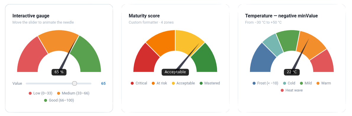
Live Demo
Interactive examples — loaded via CDN, no build step required.
Interactive
Move the slider to animate the needle
Maturity score
4 zones · text formatter
Temperature — negative minValue
From −30 °C to +50 °C
Full-circle 360° gauge
circumference: 360 · cutout: 70%
Thin ring — cutout 80%
Minimalist style
Hidden label · Thin needle
valueLabel: { display: false } · widthPercentage: 1.5
Dataset Properties
| Property | Type | Default | Description |
|---|---|---|---|
value |
number |
— | Required. Current needle position. |
minValue |
number |
0 |
Minimum gauge value (offset starting point). |
data |
number[] |
— | Required. Segment boundary values (cumulative). |
backgroundColor |
string[] |
— | Colors for each segment. |
needle |
object |
— | Per-dataset needle override (see Needle options). |
valueLabel |
object |
— | Per-dataset value label override ({ display: false } to hide). |
Segments vs. value
data defines the segment boundaries on the gauge arc. The value property controls where the needle points independently of the segments.
// Three segments: 0–33 (red), 33–66 (orange), 66–100 (green)
// Needle at 50 (in the orange zone)
datasets: [{
    value: 50,
    data: [33, 66, 100],
    backgroundColor: ["#E15759", "#F28E2B", "#59A14F"],
}]
Using minValue
// Gauge from -20 to +20, needle at +5
datasets: [{
    value: 5,
    minValue: -20,
    data: [-10, 0, 10, 20],
    backgroundColor: ["#d32f2f", "#ef5350", "#66bb6a", "#2e7d32"],
}]
Options
Needle
Configure via options.needle (or override per dataset with dataset.needle):
| Option | Type | Default | Description |
|---|---|---|---|
radiusPercentage |
number |
2 |
Needle pivot circle radius as % of chart width. |
widthPercentage |
number |
3.2 |
Needle base width as % of chart width. |
lengthPercentage |
number |
80 |
Needle length as % of the arc depth (inner→outer radius). |
color |
string |
"rgba(0, 0, 0, 1)" |
Needle and pivot circle fill color. |
options: {
    needle: {
        radiusPercentage: 2,
        widthPercentage: 3.2,
        lengthPercentage: 80,
        color: "rgba(0, 0, 0, 1)",
    },
}
Per-dataset needle
You can override needle on each dataset to get multiple needles in one gauge
(e.g. an analog clock with hour and minute hands):
js
datasets: [
  { value: minuteVal, data: [...], needle: { color: "#36a2eb", lengthPercentage: 88 } },
  { value: hourVal,   data: [...], needle: { color: "#ff9f40", lengthPercentage: 72 } },
]
Value Label
Configure via options.valueLabel:
| Option | Type | Default | Description |
|---|---|---|---|
display |
boolean |
true |
Show or hide the label. |
formatter |
function |
(v) => String(v) |
Format the displayed value. |
fontSize |
number |
12 |
Font size in pixels. |
color |
string |
"rgba(255, 255, 255, 1)" |
Text color. |
backgroundColor |
string |
"rgba(0, 0, 0, 0.85)" |
Background fill color. |
borderRadius |
number |
5 |
Background corner radius in pixels. |
padding |
object |
{top:6, right:14, bottom:6, left:14} |
Inner padding. |
Formatter examples
formatter: (value) => `${value}%`                            // percentage
formatter: (value) => value >= 80 ? "Excellent" : "Moyen"   // label
formatter: (value) => new Intl.NumberFormat("fr-FR",
    { style: "currency", currency: "EUR" }).format(value)    // currency
Arc (inherited from Doughnut)
| Option | Default | Description |
|---|---|---|
rotation |
-90 |
Start angle in degrees. |
circumference |
180 |
Arc span in degrees. |
cutout |
"50%" |
Inner radius as % of outer radius. |
360° gauge
For a full-circle gauge, set circumference: 360.
For it to start at 12 o'clock, use rotation: 0
(Chart.js internally shifts the start angle by −90°).
Examples
Maturity score (0–100, three zones)
new Chart(ctx, {
    type: "gauge",
    data: {
        datasets: [{
            value: 72,
            data: [40, 80, 100],
            backgroundColor: ["#E15759", "#F28E2B", "#59A14F"],
        }],
    },
    options: {
        needle: { color: "#333" },
        valueLabel: {
            formatter: (v) => `${v} / 100`,
            backgroundColor: "#333",
        },
    },
});
Full-circle gauge (360°)
new Chart(ctx, {
    type: "gauge",
    data: {
        datasets: [{
            value: 270,
            data: [90, 180, 270, 360],
            backgroundColor: ["#4e79a7", "#f28e2b", "#e15759", "#76b7b2"],
        }],
    },
    options: {
        rotation: -180,
        circumference: 360,
        cutout: "70%",
        valueLabel: { formatter: (v) => `${v}°` },
    },
});
With Chart.js datalabels plugin
import ChartDataLabels from "chartjs-plugin-datalabels";
Chart.register(ChartDataLabels);

options: {
    plugins: {
        datalabels: {
            formatter: (value, ctx) => ctx.chart.data.labels[ctx.dataIndex],
        },
    },
}
Laravel / Vite Integration
Add an alias in vite.config.mjs:
import path from "path";

export default defineConfig({
    resolve: {
        alias: {
            "@sourcentis/chartjs-gauge": path.resolve(
                __dirname,
                "vendor/sourcentis/chartjs-gauge/dist/chartjs-gauge.esm.js"
            ),
        },
    },
});
Then import normally:
import "@sourcentis/chartjs-gauge";
API
Named export
import { GaugeController } from "@sourcentis/chartjs-gauge";

// Manual registration (if you don't want auto-registration on import)
Chart.register(GaugeController, ArcElement);
Default export
import ChartjsGauge from "@sourcentis/chartjs-gauge";

ChartjsGauge.install(Chart); // same as Chart.register(GaugeController, ArcElement)
Browser Support
Same as Chart.js v4 — all modern browsers (Chrome, Firefox, Safari, Edge).
Contributing
git clone https://github.com/sourcentis/chartjs-gauge
npm install
npm run dev    # watch mode
npm run build  # production build
License
Acknowledgements
Inspired by chartjs-gauge by haiiaaa and chartjs-gauge-v3 by uk-taniyama.